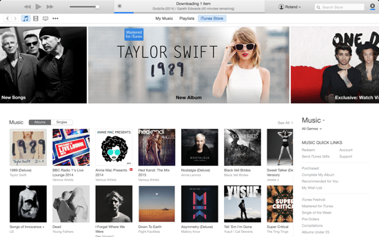
iTunes 12 was released as a beta earlier in the year for OS X Yosemite, and is now available for new users and also as an update to iTunes 11. There aren’t a whole host of improvements, but there are some subtle changes which are definitely welcome over iTunes 11.
The last version of iTunes was completely redesigned and updated at the end of 2012, bringing with it quite a radical overhaul compared to iTunes 10. Since then, we’ve seen various improvements and updates, but not everything that it has been criticised for has been fixed in iTunes 12.
This guide briefly describes the new look and features that made it into iTunes 12.
What’s new in iTunes 12
The first thing you’ll notice about iTunes 12 is the slightly updated design – there’s a “flatter” look that fits in more with the iOS 7 and iOS 8 style (as well as Yosemite in general).
For starters, just like every application in Yosemite, the window icons for maximise, minimise and close have all been updated and function exactly as you’d expect.
iTunes 12 also uses transparency to achieve quite a nice effect, just like many of the built-in Yosemite apps.
When you open iTunes, you will notice that the main interface has been tweaked and there’s much more emphasis on the iTunes store – not surprising considering Apple obviously wants to encourage you to buy content.
iTunes 12 also includes support for Family Sharing – that feature must be setup on iOS and links to your nominated iTunes accounts. We will cover Family Sharing in a separate post.
Icons and menus
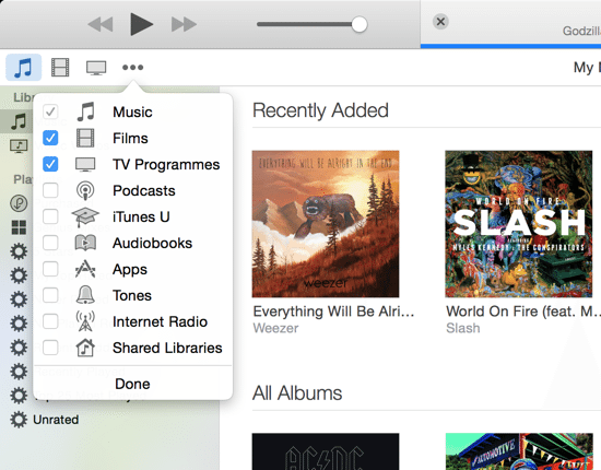
In the main menu bar there are several icons such as My Music, Playlists, and iTunes Store which replaces the old Songs, Albums, Artists, Genres, Videos, Playlists and Radio links. It looks much cleaner, and also allows you to edit which icons you want to display (click the Edit button on the dropdown, tick the items you want to use, then clock Done as indicated below).
Recently Added items
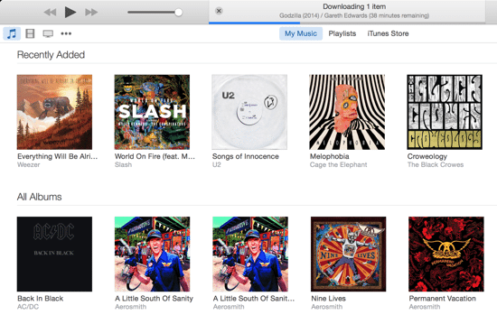
Any content that you’ve added to iTunes recently now appears at the top of the main window as shown in the screenshot below. This does make it a little quicker to access items that you’ve recently purchased (they are also still available in the Playlists section however).
Playlist view
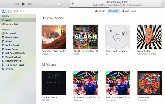
Another welcome change is that Playlists can now be viewed in the sidebar on the left, while simultaneously viewing music in the main window. This makes it easy to drag and drop songs into your playlists. The Playlists themselves function exactly as before. You can read our previous tips on creating custom playlists here.
Account information
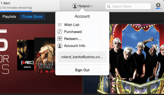
iTunes 12 has a tweaked dropdown menu that shows links to your iTunes account. From here, you can also go to your Wish List, Purchased items, as well as redeem a gift code or go to your main account information page (or sign out completely).
New item view and icons
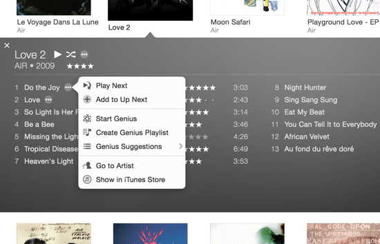
Another small change is that the album view (or any item for that matter, such as movies) now has slightly different action icons that appear when you hover over an item, and expands to reveal appropriate actions (such as Play Next, Start Genius, or go to the iTunes Store).
New devices view
In iTunes 12, each iOS devices you own now shows up in the main toolbar as an icon, which makes it fairly quick to see if your iPhone or iPad is connected. They must be on the same WiFi network and logged into iCloud/iTunes before they appear in the menu. Click any device’s icon to open the device manager view, which lets you synchronise and manage its content pretty much exactly the same as in iTunes 11.

What’s still missing in iTunes 12?
Unfortunately for those of us using the UK iTunes store, iTunes Radio is still not available. Let’s hope this service is rolled out soon (as it’s been available in the US for some time). Since the Apple acquisition of Beats Audio earlier this year, the rumours are that Apple has something more radical planned for radio and streaming music, so we might see some major changes in iTunes 13 next year.
There are still plenty of other items on our wish list that didn’t make it into iTunes 12.
Some of these include:
- iTunes DJ. This feature is still missing in iTunes 12, and is one that many people have complained about. We’d definitely like to see this return in a future version.
- Cover flow. The ability to view your media library in as a cover flow wasn’t necessarily that useful, but again would be welcome to return in iTunes 13.
- Separate apps. iTunes has so many different sections and does so many things, that in future it might make more sense to split out some of the functionality into distinct applications, just like iBooks has it’s own app.
- Common folders. With multiple user accounts, your iTunes content is duplicated across folders for each user, which obviously wastes previous hard disk space. It would be great if you could share the same content across multiple users.
Summary
iTunes 12 is a definite improvement over iTunes 11 in terms of the user interface. However, there aren’t really that many new features besides minor user interface tweaks and a fresh look.
iTunes 13 will no doubt be a more dramatic overhaul, and is expected to introduce features such as a subscription-based music streaming service thanks to the Beats Music deal.
On the whole iTunes 12 is a solid release and is definitely worth upgrading to. It’s still a great music player and probably the best place to purchase legitimate iTunes content that can be shared easily on every device and with different family members.



Add Comment