Apple has added a fair few new features to its new version of OS X, El Capitan, even though the main focus is on performance. There are little tweaks and streamlined ways of interacting here, there and everywhere, and thankfully Safari hasn’t been left out.
Safari is of course the default browser on the Mac, and it’s also one of the fastest for Javascript, making sites load quickly. If you use Safari every day like I do, you’ll appreciate some of the refinements in the latest version.
This post provides a quick run down of some of those changes and improvements.
Improved audio management in tabs
Have you ever opened dozens of tabs and find that one of them is playing an audio track such as an advert? Or perhaps you’ve opened YouTube and played a couple of songs, only to find that later you have to quickly scan your open tabs to get back to the one that you want to mute?
Safari now makes it much easier to see at-a-glance which tab is playing audio, as well as allowing you to mute all tabs or a single tab.
Any tab that is playing audio now displays a small speaker icon at the right side of the tab itself, as shown below:
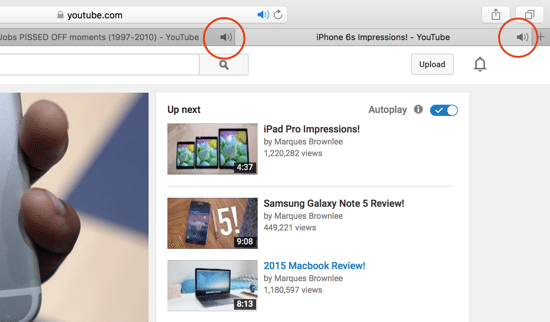
To mute an individual tab, simply click the icon to mute the audio. Likewise, to un-mute just click the icon again.
Notice that in the title bar, there’s an identical icon (in blue) that’s solid if the current tab is playing audio, or just shown as an outline if it’s on another tab.
In the screenshot below, I have selected a tab where there is no audio content, and the task bar audio icon is shown as a blue outline:
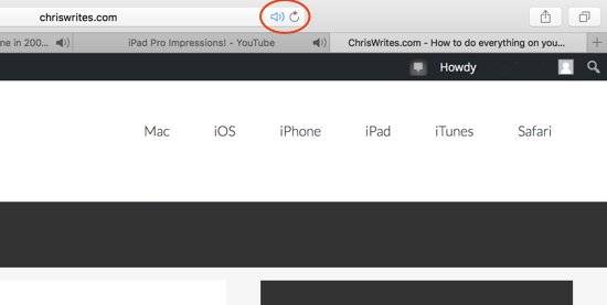
The icon that appears on the task bar changes functionality slight depending on whether your currently selected tab is playing audio. Clicking the task bar mute icon will mute / un-mute all other tabs if you don’t have any audio on the current tab. However, if the current tab is playing audio, the default action of the task bar icon is to mute / un-mute the current tab. Confused? It’s pretty natural and intuitive once you actually use it…
If you click and hold the audio icon in the task bar, you’ll also see various options to mute / un-unmute tabs, as well as a list of tabs that are playing audio. By clicking on any of those tabs, you’ll be taken straight there.
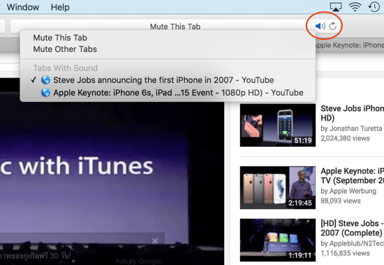
You can perform the same action on the audio icon on any tab, so see a similar set of options.
The audio management in Safari is a small but welcome addition, finally enabling you to turn off those distracting (and too loud) pop-up ads that somehow make it past the pop-up blockers!
Pinned sites
In another change to the way that tabs can be managed, Safari now lets you “pin” tabs to the left side of the tab bar. It’s quite useful for those sites that you always have open, but don’t want them to take up too much room in the tab bar.
To use the feature, simply grab any tab and slide it all the way to the left, where it appears as a much smaller mini tab with its icon simply show as a single letter. In the case of this particular website, Chris Writes.com is shown as a black icon with a grey “c”, helping you to quickly identify it later on.
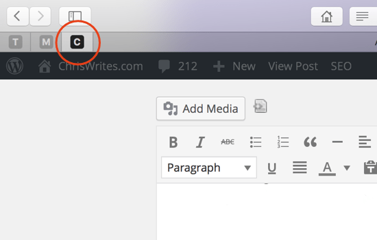
If you select any of your pinned sites, any other pinned sites’ icons are just greyed out.
You can also “unpin” sites by selecting them and dragging back toward the right until they become a regular, full-size tab again.
There do seem to be a couple of quirks however when using the keyboard shortcuts to close a pinned tab. For example, usually with a regular tab open, Command + W will close the tab and take you to another that’s open.
With a pinned tab selected, Command + W seems to just take you to an open tab, if there is one – the pinned tab is not closed, which is not necessarily the expected behaviour. Whether this gets fixed or is a feature remains to be seen.
This is what happened when writing this article in a pinned tab, after attempting to close my only regular tab:
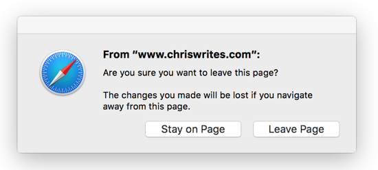
The second quirk we’ve noticed is that when closing the last “regular” tab, if you have any pinned sites Safari pops up a dialog asking if you want to close them. On other occasions (it depends what you have open in those pinned sites), Safari returns to non-fullscreen mode and closes everything. This behaviour definitely seems like a bug and something that will hopefully be rectified when El Capitan is officially released.
Slide-to-open Sidebar in fullscreen mode
The sidebar in Safari houses several things: bookmarks, your reading list, and shared links.
In the past, the fastest way to show / hide the sidebar was with SHIFT + COMMAND + L, though you could always just choose Show Sidebar from the View menu or just se the icon next to the back/forward buttons. Any of these will open the sidebar and keep it open, or close it if when already visible.
In El Capitan however, there’s a new way to get to the Sidebar – by sliding your mouse cursor over to the far left of the screen while in Safari’s fullscreen mode, which opens the Sidebar temporarily in a slide-in fashion. If you try and nothing happens just try pushing further to the left, and it should appear as shown below:

Likewise to close it, move your mouse pointer back toward the centre of the screen again.
This is one of those features that is rather intuitive, and once you start using it you’ll probably ditch the old method if you just want to quickly find something (as long as you’re in fullscreen mode, of course).
Notice that the slide-in Sidebar appears as an overlay on top of the website as a semi-transparent layer.
The original method of opening the sidebar and shifts the web page to the right, while the sidebar stays open. You’ll notice the difference between the screenshot above and this one:

New Status Bar behaviour
The status bar at the bottom of the Safari window has always been a useful little area to show you information about links you’re hovering over. The trouble is, it does take up a little bit of screen space (an important consideration to those of us on laptops) and adds to the general screen clutter.
In El Capitan, Apple has done away with a full Status Bar as such and now shows a semi-transparent status bar that appears temporarily for a second or so as you however over a link, and disappears afterwards. It’s a nice tweak for anyone that appreciates minimalism.

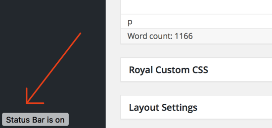
You can still use Command with / to turn the Status Bar on and off of course. There’s also a handy little notification when it’s enabled:
AirPlay web videos without showing your whole screen
AirPlay has always been a great way to mirror your Mac’s screen on your Apple TV, or play iTunes content for example. Safari in El Capitan also lets you play a web video (such as those on YouTube) directly on your Apple TV without sharing the rest of your Mac’s screen.
Find a video to play, and you’ll notice the small AirPlay icon on the bottom of the video player (though Apple says it doesn’t work with all video content yet):

Clicking the AirPlay icon opens a prompt that lets you choose which Apple TV to play the video on, as shown below:

Summary
El Capitan is a really solid update to OS X. As a user of the developer build since day 1, it’s been one of the most stable pre-release versions I’ve ever used. With the latest Golden Master release (which should be near-identical to the official, finished version), performance is great and very stable.
The changes to Safari are admittedly small but welcome, strengthening its position as one of the very best and capable browsers for all Mac users.


Has anyone found out how to disable the “Slide-to-open Sidebar” function? I find it more intrusive than intuitive. The icon is there for a reason; I click it when I want to see my bookmarks and reading list.