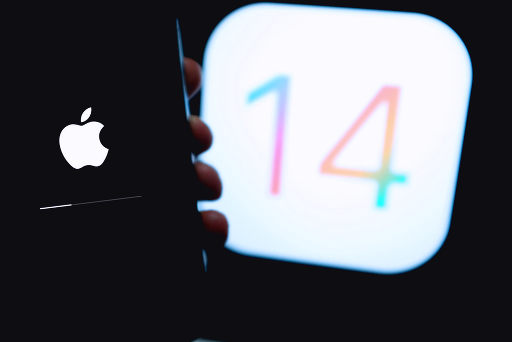
Apple unpacked a number of new features in iOS 14 at the WWDC event on Monday, including a completely redesigned Widgets system, an App Library and a picture-in-picture mode.
Apple used the online-only conference to give users a first look at what they can expect to interact with when the new mobile operating system launches later this year.
The preview of iOS 14 showed big changes for Apple, especially on the design front, which is arguably the biggest departure for the company since iOS 7.
The new-look home screen centres on Widgets, which have made the move from the Today View and can now be customised and added alongside general app icons.
Apple will also introduce a ‘Smart Stack’ widget that serves up personalised apps to users depending on the time of the day.
This means that a calendar widget, for example, could be shown in the morning at the top of the screen before changing to news and health-related data later in the day.
The new App Library also automatically organises apps into relevant groups such as ‘social’, ‘entertainment’ and ‘creativity’.
This builds on the standard folder system that allows users to group together their apps as they see fit.
Another welcome addition is the picture-in-picture mode that enables users to watch a video while browsing websites or navigating the home screen.
Perhaps the most requested feature that has made the cut this time is a less obtrusive system for incoming calls.
Currently, these calls take up the entire screen, which can be frustrating for users completing important tasks.
iOS 14 will finally present calls via a compact banner at the top of the screen.
Apple has done the same for Siri, its smart assistant that used to hog iPhone screens – it will now use a subtle design in the lower part of the screen.


Add Comment