OS X

A Definitive Guide to What’s New in Mac OS X Lion

With Mac OS X Lion Apple has tried and succeeded in bringing the best of the iPad back to the Mac. iOS introduced so many fantastic features to the iPhone and iPad that it was only right that Apple bring some of these features back to the Mac.

It is obvious from the moment you start to use Lion that Apples aim has been to try and unify there iOS and Mac OS offerings. The features Apple has chosen to implement into Lion feel very natural and fit right in at home on the Mac, It doesn’t feel like Apple has tried to force an iPad into a Mac you get that they have really thought about which features would work well and be of benefit to Mac users experience on the desktop.

All features I have highlighted in this article are features that I feel are the real gems of this latest update to Mac OS X. Lion is a fantastic update to the Mac that users will really love to use, It will offer so much for such a small price tag, It is definitely going to be a hit with users and reviewers alike. Apple truly can define Mac OS X as being ‘the most advanced desktop OS’ on the market because with Lion it has once again put Apple years ahead of the competition!

New Gestures

Mac OS X Lion Gestures

Gestures have been greatly improved in Lion making for a more iPad like experience on the Mac. Apps like Safari make good use of gestures instead of hitting the back and forward buttons you can now just swipe left or right and your pages slide back or forward. Switching between spaces is now a breeze just swipe with four fingers left or right and the desktops animate in and out so beautifully. Full Screen Apps make so much sense because of gestures as it’s so easy to swipe in an out of a full screen space. Navigating around the Mac just feels so much more natural and fluid now, It will bring your Trackpad, Magic Trackpad and Magic Mouse to life.


Gestures based Navigation

Mac OS X Lion Coverflow
Mission Control displaying Minimized windows using a CoverFlow style Interface

Gesture based file navigation has also been introduced with an extension of CoverFlow, It has first of all been built into icon view in the Finder, If you have more files than are viewable on a single line in Finder just swipe your fingers left to right over then file icons and Finder will flow through them CoverFlow style, Secondly it has been implemented into Mission Control, When you swipe to enter Application view in Mission Control all files opened by that application recently are shown as icons along the bottom of the screen navigating through them is done using CoverFlow this is also the case for application windows that are minimized in the dock it is a really nice added detail that you have to use to really fully appreciate it.


Mission Control
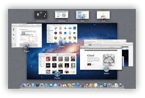
Mac OS X Mission Control
Mission Control Exposé style interface with spaces shown along the top of the screen

Lion has merged Exposé, Spaces and Dashboard to create Mission Control. On entering Mission Control you will be presented with a familiar Exposé style interface but now spaces are presented along the top of the screen for you to select or swipe between. Dashboard is now also just a swipe away and occupies its own ‘space’
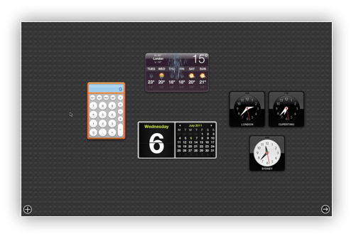
Mac OS X Lion dashboard
New Dashboard Interface

Mission Control is also the hub for ‘Full Screen Apps’ entering full screen in an app such as Safari will transform each window that you click to make full screen into its  very own space which can be accessed by a three finger swipe from space to space or by a three finger swipe up to enter Mission Control were you will find all spaces displayed along the top of the screen.

With Mission Control and Gestures Exposé hot corners effectively becoming redundant, You can still set hot corners but with gestures you will soon get used to entering Mission Control for all your switching need.


Mac App Store
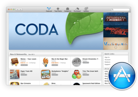
Mac OS X Mac App Store
Mac App Store showing featured content

Snow Leopard users will be very familiar with the Mac App Store having been launched last year. The Mac App Store is going to become a huge part of Lion (You will even need it to buy Lion) Apple is really starting to push digital distribution of software on the Mac after the huge success of the App Store for iOS. Its safe to assume retail boxed software will soon disappear from Apple Retail Stores as most developers start to opt to have there software titles included in the Mac App Store. The Mac App Store works just like on iOS offering all the best software titles available for the Mac, Downloading an App from the App Store is coupled with some really cool animations that ‘pull’ the App from the store right into Launchpad. iOS users will find it a home from home, It really will become the only place you buy software from!

Lion Mac OS X App Store Updates
All software is kept up-to date with the App Stores built in update mechanism allowing users to download the latest versions with ease.

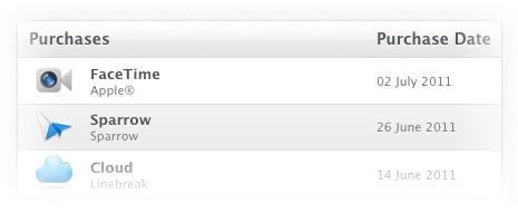
Mac OS X Lion Purchased Button

Purchases information in Mac App Store

Tracking Apps you have purchased has been made easier with an easy to view page accessible directly from the Mac App Store UI unlike in iTunes were you have to log into your account and search through your purchase history receipts. You can even reinstall an app directly from this page.


Launchpad
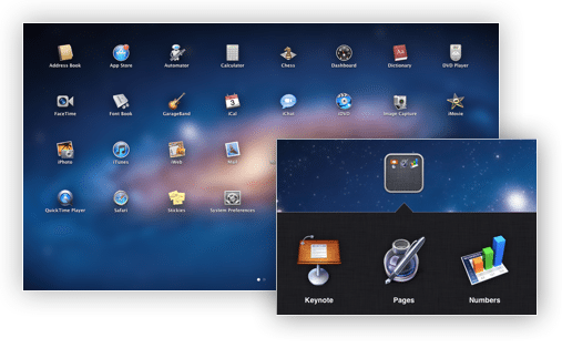
Launchpad in Mac OS X Lion

Lion brings iOS style application launch and folders to the Mac with Launchpad. A simple four finger pinch on your trackpad and you enter Launchpad were you will find every app you have installed on your Mac. iOS style folders also allow you to organize your apps into folder ‘categories’ which makes for a much more logical application organizer and launching solution. Launchpad really brings the dock and Finder together to create a more unified environment where your apps live.

launchpad delete icon
Launchpad icon showing delete button

Uninstall has never really existed on the Mac so its always been a case of dropping an App in the trash and then emptying it, Now with Launchpad deleting an App is just like it is in iOS just hold down an app, All the icons will start to ‘jiggle‘ then just click the apps delete button and its gone! Reinstalling is simple just download it again from the Mac App Store.

Lion launch pad installer
Application Download and Install progress in Launchpad

Once you buy an app from the Mac App Store it will ‘jump’ into Launchpad and start downloading and begin to install just like in iOS you can even pause the download in Launchpad by clicking on the icon while it is downloading.


Resume

Lion has completed redefined the state of what it means for an application be open or closed, Every time you ‘quit’ an application within Lion all windows and data goes into a kind of suspended animation just like in iOS when you exit to the home screen then when you return to the App your back to where you left off. Now this does take some getting used to and in ‘certain scenarios’ you will want to make sure you close all windows before you quit or the next time you open that app you (and anyone around you) will be presented with whatever you were doing last time.

It also means that if an app crashes your work isn’t lost as it will have been saved in the state you left it, This will most definitely become a life saver when you are working on a document and Mac OS X decides its had enough and crashes.

You can even shutdown your Mac completely and when you return everything will still be as you left it, Meaning you no longer have to leave your Mac asleep just to save time next time you want to use your computer.


Versions
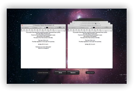
Versions in Mac OS Lion
Versions ‘Time Machine’ Interface

Versions in Lion now brings the ability to save multiple versions of a document within itself so if you are like me and are always creating one draft after another you know what happens you end up with a mass of documents each one slightly different, This can be a nightmare when you are searching for the version you want and of course is a waste of hard disk space, With Versions each ‘version’ is stored in the one ‘container’ file so when you want to access each version you simply click on the document name in that windows title bar and you will be presented with a drop down menu were you can click ‘browse all versions’ this will bring you to a time machine like interface were you can fly back in time and preview each version of that document then open the one you are looking for. It’s really cool!


Auto Save
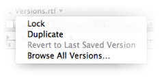
Autosave in Mac OS X Lion
Auto Save drop down selection menu

Auto save has been a feature present in TextEdit for years now Apple has taken it system wide, Documents just automatically save as you work on them so you never lose your data. You are able to also lock a document to prevent accidental overwrites to its content, This feature also integrates with Versions giving you the option of reverting a document to the way it was the last time you opened it.


AirDrop
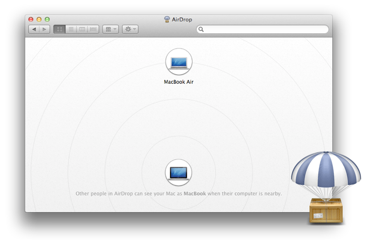
Airdrop Window MAc OS X Lion
AirDrop interface in Finder

AirDrop has truly made sharing files between multiple Mac’s really easy! The AirDrop interface is so cool you are presented with a radar inspired Finder window, Small bubbles represent all the Mac’s around you, As with anything Mac OS X drag and drop plays a huge role, Sharing a file is as simple as just dropping the file you want to send on the persons ‘bubble’ and once they accept the send request the file magically appears in there downloads folder. This will make sharing files with your friends and family a doddle and best of all it requires zero setup so no need to sit for hours playing with settings with Lion the magic just happens.


Unified Mail, Address Book & iCal
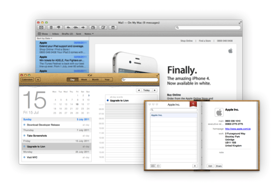
unified maili cal address book in Lion
New Mail, Address Book and iCal iOS Inspired Interfaces

Mail, Address Book and iCal have all had major makeovers in Lion all taking inspiration from there iPad counterparts. Mail on the Mac now feels much smoother and cleaner compared to previous versions, The interface really works with you, Focusing on your mail by grouping each message into ‘conversations’ enabling you to track the thread of your messages right back to the beginning of an exchange. You can now preview messages right in list view just like on the iPad and iPhone so you get a sneak peak at what each message contains before you open it, This is coupled with QuickLook integration to preview links and attachments contained in messages.


iOS style message preview in Mail


Full Screen Mail in Lion
iPad inspired message composing window in Full Screen Mail

You will notice iOS style animations are present throughout Lion especially within an apps full screen view, For example when you compose a new message in Mail, The compose window will slide in from the bottom of the screen just like on the iPad.


New Twitter and Facebook features built into Address Book

Address book has been completely redesigned, Its such a joy to use now! Your contacts are the focus and a lot of the interface clutter of earlier versions has been completely eradicated. FaceTime calling is now capable from Address Book so if you have a contact with FaceTime just a quick tap on there address and FaceTime will start the call, Apple has also taken to adding social network fields to so you can add all your contacts social network profiles into Address Book so now seeing a persons Facebook page and photos or sending someone a tweet on Twitter is as easy as couple of clicks.

quick event and reminders in Lion
Quick Event and Reminders

iCal has had a major interface lift, At first it is a shock to see a completely different UI in comparison to the rest of Lion but you soon begin to understand that Apple has done it to unify there apps across iOS and Mac OS X it makes using applications on both platforms a very familiar experience no matter what device you are using this is especially going to be the case to new users who have not experience the Mac before but are familiar with the iPad. Day view has seen some improvements now the mini month calendar is always visible and you can scroll through all your events in the future without switching to week or month view. A year view has also been added to, This will come in handy when you are wanting to jump between months quickly. There is now also a new intuitive quick event button, You can now enter an event using phrases such as ‘Birthday Drinks at 9PM’ and iCal will know what you mean and add ‘Birthday Drinks’ as an event at 9PM, This will save time when you want to quickly add an appointment on the go. A feature also now in Lion that has long been requested in iCal is Reminders (todo’s) will soon be able to sync with iOS devices once iOS 5 is released.

Whats New in Safari:

Downloads List

New Download List drop down in Safari

Tucked away next to the search box on the toolbar in Safari is the new downloads list button, Now instead of having the ‘Downloads Window’ when you download something in Safari it ‘jumps’ off the page and onto the Downloads button where a tiny progress bar will appear and clicking on it will pop up a drop down list of all previous downloads. This a great little improvement that really gives a clutter free feel to Safari.


Reading Lists

Reading List draw in Safari

Safari 5 in Lion has a new built-in bookmarking feature called ‘Reading List’ this feature allows you to bookmark stories or links that you want store to read later, This feature aims to improve on services like Instapaper by integrating the bookmarking features right into the browser, Reading list will even be making its way to the iPhone and iPad in iOS 5 so you can keep all your bookmarked ‘read laters’ synced across all your devices.


Finder Inhancements

The Finder in Lion brings some minor ‘but well thought out’ improvements and a much more intuitive UI.

Icon Drag UI Lion
New Icon Drag UI

The tweaked UI will be the first thing you notice it has been polished and feels a lot nicer to use (long time Mac users should really appreciate this) Dragging multiple files has also seen a slight UI improvement, All files being dragged are now grouped together into a collection to make a single icon which is then overlaid with a bold red number indicator displaying how many files you are dragging this just makes for a cleaner and clearer look and view when moving multiple files from one place to another.

All My Files Finder Sidebar Favorite

A new favorite has also been added to the sidebar called ‘All My Files’ which is exactly what its name suggests a Finder window containing all your files sorted by file type this makes finding all files of a certain kind on your system really easy.

Copy Dialog box showing new ‘Keep Both Files’ option

Lion also brings a feature that has been much needed for some time. If you attempt to add a file to a folder with the same name you no longer get told you can’t now you get presented with the copy window and instead of getting presented with just ‘Stop’ and ‘Replace’ you now have a new option called ‘Keep Both Files’ clicking this option adds the file to the folder and renames it automatically for you so you can keep both files without having to manually change the name of the file.


QuickLook

QuickLook a link within a Mail Message

QuickLook has been improved in Lion it is now far more reliable and is not just limited to the Finder anymore, You can now QuickLook a file in any app that supports it, Mail now allows you to QuickLook a link or attachment within any message without having to open it first to see what it is. Another much welcome improvement is that you can now QuickLook a file in a stack this one has been long in the waiting but has made its way into Lion. System wide QuickLook integration is such a logical improvement to this time saving feature.

QuickLook dictionary definition in Spotlight

Apple have even managed to squeeze it into spotlight type your search, then hover over a result and you will get an on the fly preview ‘bubble’ of its content.

System wide interface changes

Scrolling

Lion introduces iOS style scrolling across the entire system, This makes navigation so much more intuitive, At first you might find it a bit tricky because scrolling is reversed, Content moves in the direction your fingers move but it make so much sense once you get used it and will be second nature if you have an iPad or iPhone. Scrollbars are now only there when you need them they overlay the content of a window and fade away when you don’t need them this make for a much cleaner looking and clutter free interface.

Resize

This is not the biggest of features but one that has been in the making for years for the Mac its a feature Microsoft Windows has had for years and now its finally on the Mac! No longer do you have the re-sizer tab in the bottom right hand corner of each window now you can resize a window from any edge just float your mouse over the edge of a window and you will see a double ended arrow just click and drag to resize with ease.


Spell Check

Lion Spell Check

Since iOS first arrived into the world it had the ability to suggest alternative words when you made a spelling mistake well now that has made its way over to the desktop, Instead of just getting a red line under a word highlighting a mistake Lion will provide an iOS style character picker allowing you to choose an alternative and if you keep typing OS X will try to automatically guess what you mean’t and change the word for you just like on the iPhone and iPad.


Full Screen Apps

Fullscreen Apps in Lion

The familiar full screen button is now integrated into nearly every built in Mac OS X application located in each windows title bar on the right hand side, Clicking this button will transform the window into a full screen ‘space’ when you first read this you will be thinking ‘every single full screen window becomes a space’ I felt the same trust me once you use it it makes so much sense coupled with gestures switching between full screen apps is so simple just a quick swipe and your there.


Is there anything we have missed that your excited to get you hands on in Lion? – If so please let us know in the comments below!

About the author

Chris

I've been a passionate evangelist for Apple and the Macintosh throughout my working life, my first love was a Quadra 605 working with a small creative agency in the south of Norfolk UK in the mid 1990's, I later progressed to other roles in other Macintosh dominated industries, first as a Senior graphic designer at a small printing company and then a production manager at Guardian Media Group. As the publishing and printing sector wained I moved into Internet Marketing and in 2006 co-founded blurtit.com which grew to become one the top 200 visited sites in the US (according to Quantcast), at its peak receiving over 15 million visits per month. For the last ten years I have worked as an Affiliate and Consultant to many different business and start ups, my key skill set being online marketing, on page monetisation, landing page optimisation and traffic generation, if you would like to hire me or discuss your current project please reach out to me here.

You can also follow me on: and

1 Comment

Click here to post a comment

Leave a Reply

This site uses Akismet to reduce spam. Learn how your comment data is processed.

  • what’s the difference between ‘Reading List’ and a bookmark? It doesn’t seem to cache it for offline viewing. What am I missing?